Theme Features
Theme Features
The Theme comes with some unqiue and cool features.
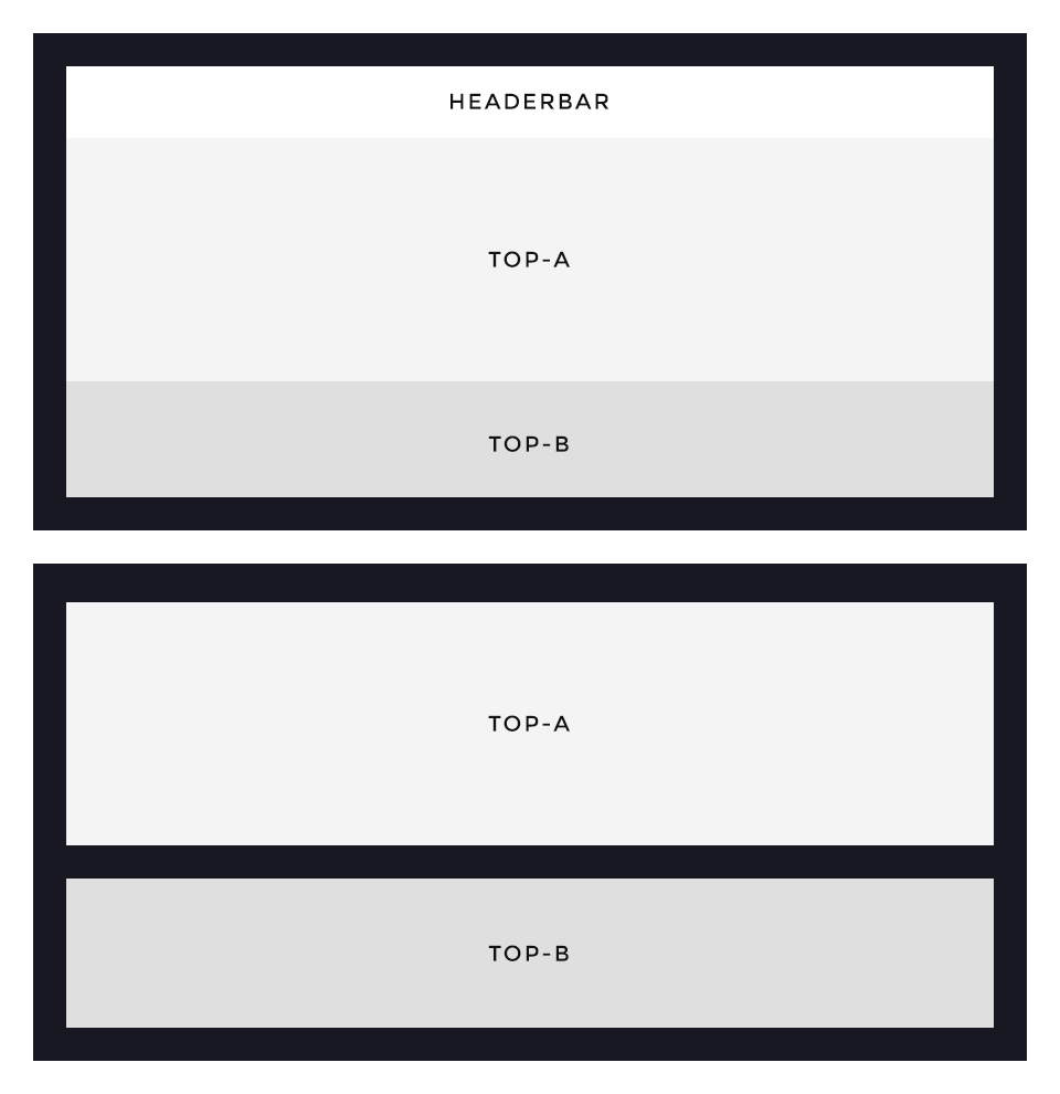
Framed Style
This theme provides a special option to display a slightly animated frame around the layout. You can decide between a frame that overlays your content and one that „hugs“ your content by adding padding around it. The width of the frame automatically adapts itself to save space on different viewport sizes.
Framed Blocks
Further you can switch on the frame block option, which will add the same spacing of the layout frame between each block section.
To edit the background color and width of the frame, use the Customizer in the Warp UI.
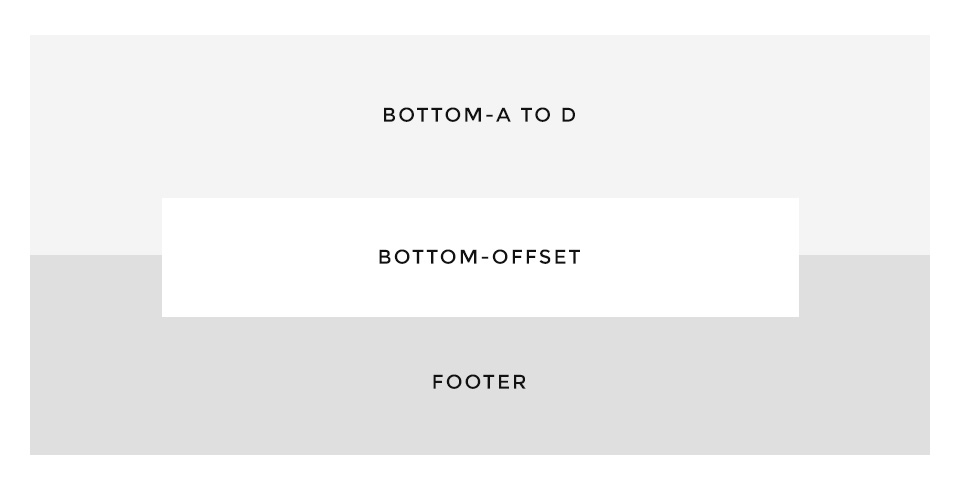
Bottom Offset
Dolce Vita comes with a special layout position called bottom-offset. It is perfect for banners or small teasers. The dimensions and spacings are calculated automatically according to the size of the published content, so that it always stays centered between the bottom and footer sections.
Footer’s block appearance
The style of this panel is bound to the footer block appearance settings. If you select the primary background and the primary contrast options for the footer, the same settings are applied to Bottom-Offset position. Otherwise it uses the default panel style.
Full UIkit Support
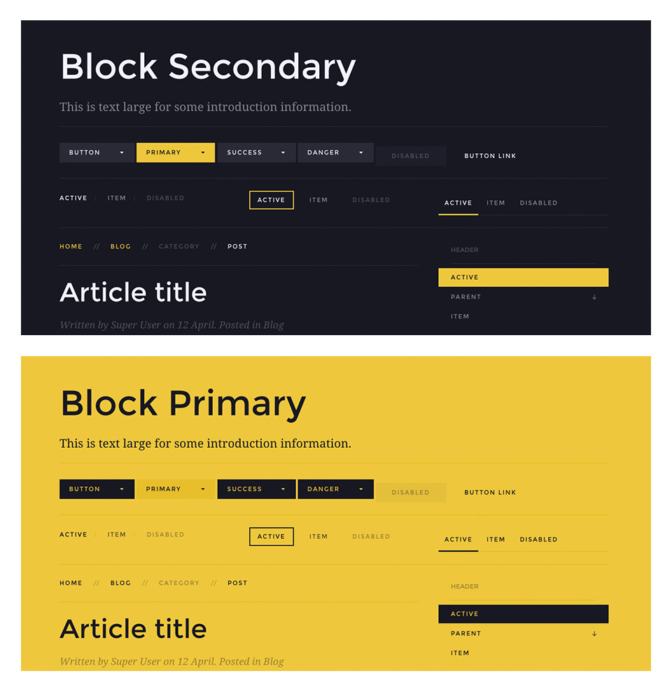
This time we decided to fully style almost everything in the contrast component .uk-contrast. This means all kinds of UIkit components like alerts, buttons, panels, subnavs, panels, text elements and forms are completely styled. We recommend this usage for dark and colored images and for .uk-block-secondary modifier class/secondary background option in the block appearance section.
Contrast Primary
We’ve added a new component – Contrast Primary, which adapts the same components as .uk-contrast specifically for primary blocks. To manually apply this modifier, use the .uk-contrast-primary class.
Easy modifications
Please use the Customizer in the Warp UI, there you will find two labeled sections Primary and Secondary, these settings will completely manage both components.
Navbar
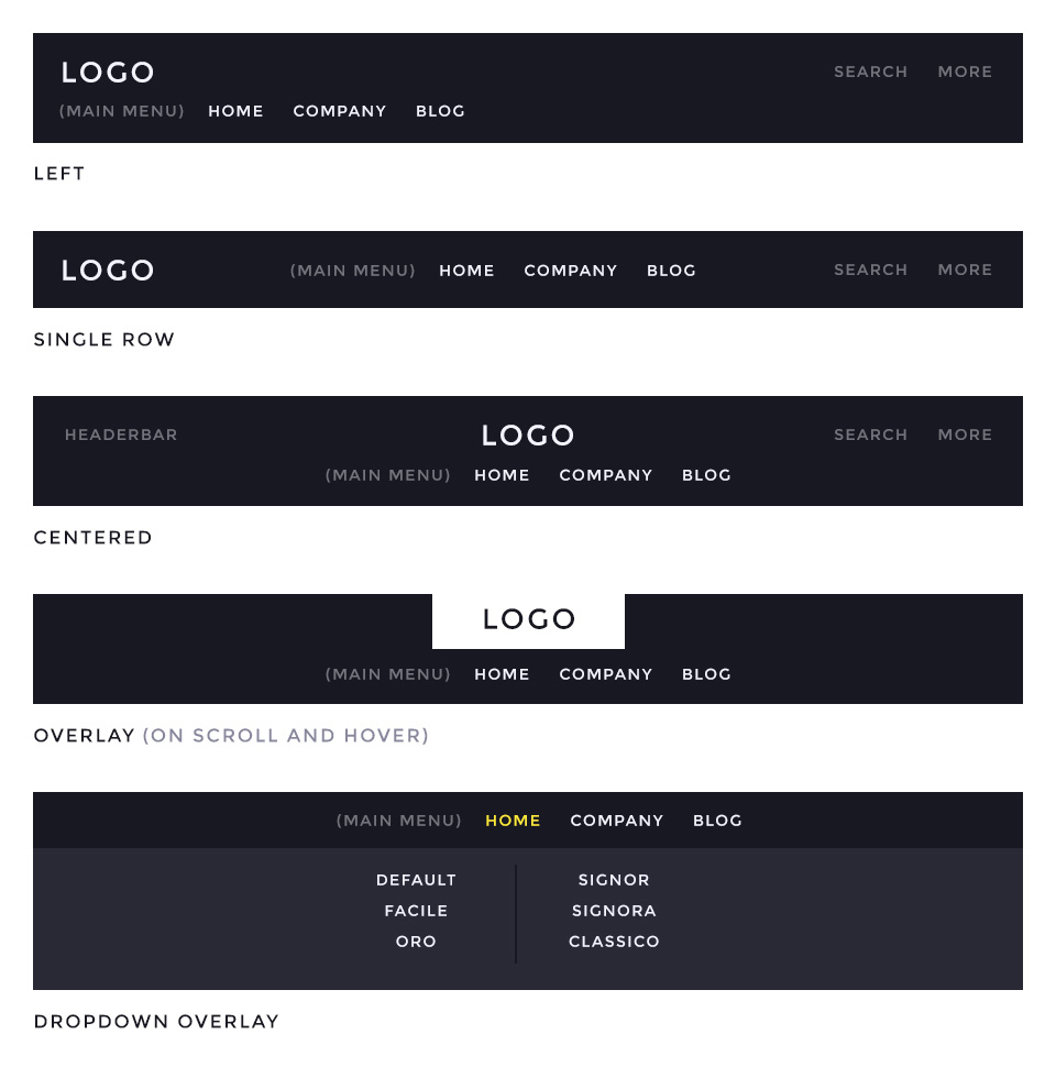
The main navigation of Dolce Vita Theme supports the latest UIkit sticky navigation component features. You are able to choose from 4 different navigation layouts.
Navigation Layouts
- Left – Logo on the left side and the menu stacked below the logo. Supports search and more module/widget positions. /layouts/header.default.php
- Single Row – Logo on the left side and centered menu items. Supports search and more module/widget positions. /layouts/header.single.php
- Centered – Logo and menu items are centered and stacked. Supports headerbar, search and more module/widget positions. /layouts/header.centered.php
Additonally, all these navbar layouts can be fixed to the browser window while scrolling.
Special Navbar Layout
- Overlay – The logo will work as a hover trigger for the navigation to display. If you start scrolling down, the navigation will also appear. /layouts/header.overlay.php
Dropdown Overlay
Enables a full width dropdown menu container which will be displayed on top of the content.
Block Appearance
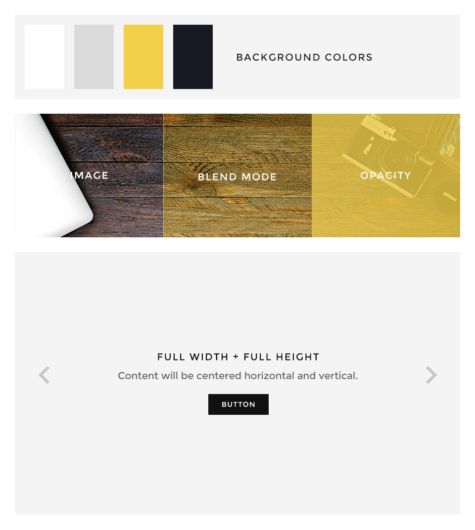
Dolce Vita supports some useful options for all block layout positions. All settings can be combined for a block position. If you need different block settings for different pages, you can use layout profiles and assign them to your menu items.
Options
- Background – Choose from 4 different background colors.
- Image – Enter a path to a background image for this position.
- Image Blend – Define how the background image will mix/blend with the background color.
- Image Opacity – Adds an overlay with the same background color of the block and an opacity value.
- Contrast – Select between primary and secondary contrast component styles.
- Padding – Select the spacing between the content and its block container.
- Full Width – This removes the constraint of the content container so it will extend to full viewport width. Recommended for full width Widgetkit slideshows, for example.
- Full Height – The block will take up full viewport height and the grid will centered within the container.
- Grid Collapse – This option will reset the grid gutter and is recommended, if you want to use a full width Widgetkit slideshow or something similar.
- Class – Use this input field for a custom CSS class which will be added to the block.
If you want to modify the background colors or paddings of the block elements, please use the Customizer and change the values.
Layout
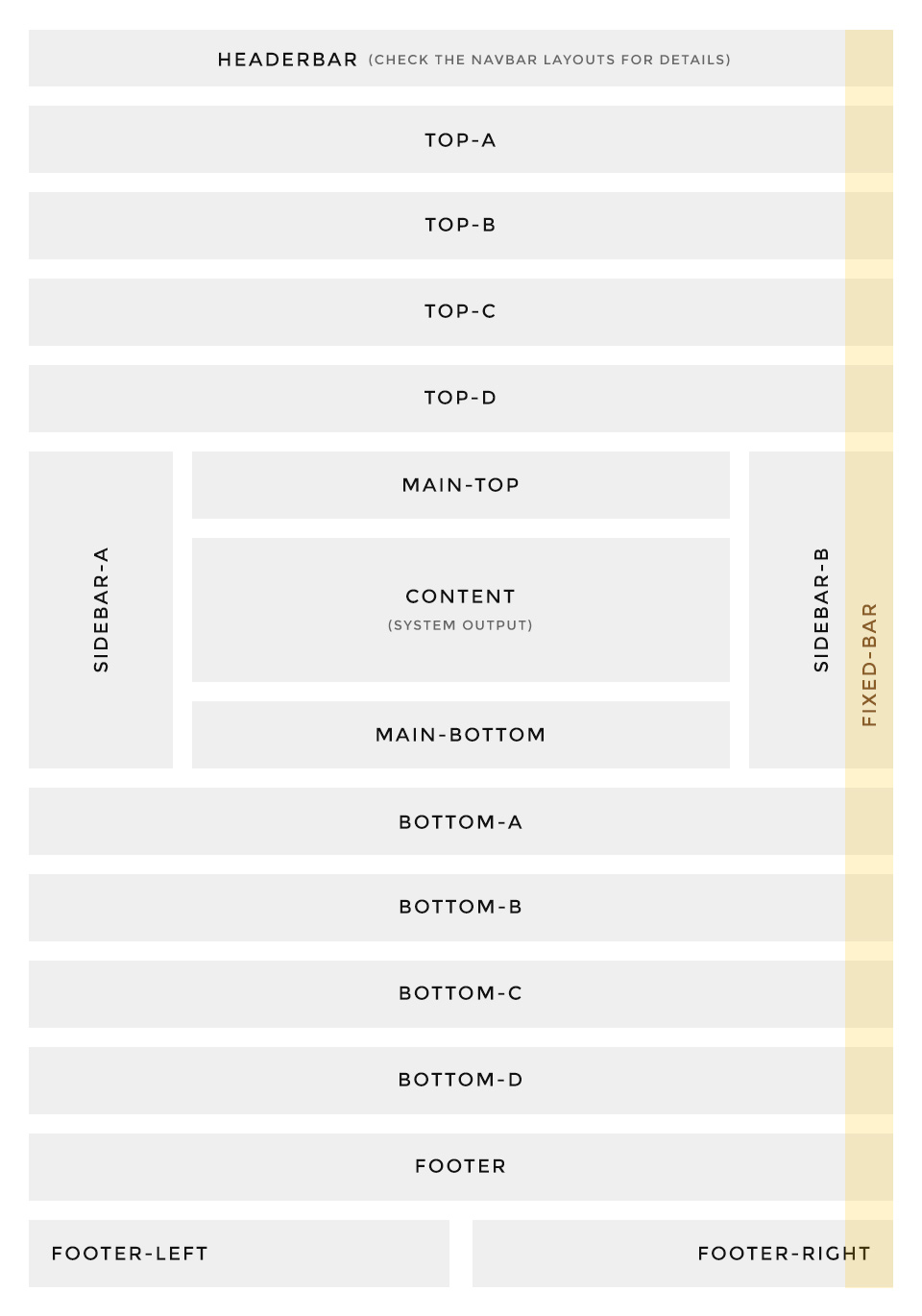
The latest Warp themes come with a handful of additonal layout positions which let’s you add and publish pretty much content/modules and widgets.
Dolce Vita also supports some special layout positions like the fixed-bar position, which has a predefined width and will always stay above any other position. We published the featured dotnav follower in our demo content on this position but you can also add any other content of course.
If you want to modify the width of the fixed bar, please take a look at the „theme“ section in the Customizer.
Headerbar / Navbar
Dolce Vita supports 4 different headerbar/navbar layouts, please take a look at the Navbar section on this page for detailed information about the possible module/widget positions.

